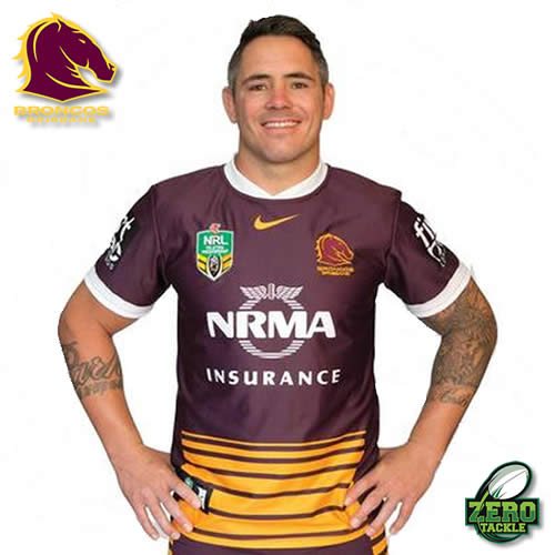
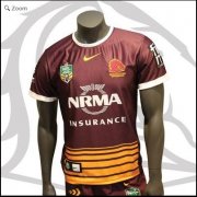
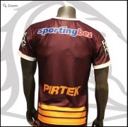
Damn. Does that same thing that bugged me with the Nines jersey (that they at least fixed for the replica release) in that the stripes don't go to the whole way around for some reason. They are less stripes and more lines. Sigh.
I like it. I've said previously that the nines jersey with the colours reversed would look alright. It's certainly one of the better designs from the past couple of years.
jesus christ, they must have hired the same guy who designed the last one. chuck a couple of yellow lines on the bottom of an all maroon jersey and call it a day. the hashtag thing is just embarrassing.
It looks alright, I don't see what all the angst is about unless you are a graphic designer or a 15 year old girl you shouldn't be so caught up in jersey 'fashion'. It's a broncos jersey, buy it and wear it